Skip to content

KOLKATA, INDIA · REMOTE · UTC+5:30

ABOVE THE FOLD

DESIGNED IN FIGMA. SHIPPED IN NEXT.

LIVE WIRE

FROM THE DESK

Clinical software is cluttered because the people who designed it never had to live in it. I drew the screens and then I built them — so every shortcut I was tempted to take showed up in my own code a week later.

— TAMAL BISWAS, EDITOR & SOLE DESIGNER

BY THE NUMBERS

4
INTERFACES DESIGNED ACROSS FOUR DOMAINS
3
PLATFORMS: WEB, iOS, DESKTOP
1
SHIPPED SOLO — FIGMA TO PRODUCTION
2+ yrs
DESIGNING AND SHIPPING REAL PRODUCT
FRONT PAGELEAD STORY · MEET THE DESIGNER

Three Platforms, One Designer — Who Also Shipped the Code.

Remote from Kolkata, currently SDE-I at Medecro.ai — Tamal Biswas is a UI/UX designer who writes the production frontend too. He owns the whole distance from a blank Figma canvas to a deployed Next.js app, which means the design never arrives at engineering as a suggestion. This broadsheet is his portfolio. Take a seat.

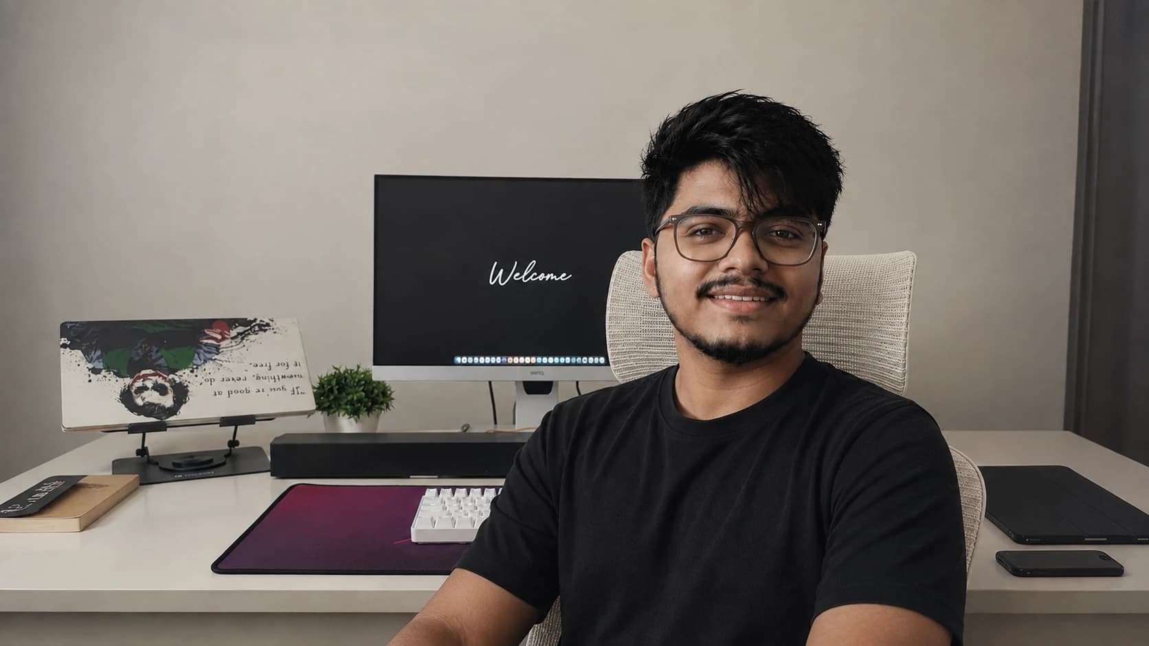
Tamal Biswas at his desk, a monitor and keyboard behind him
ABOVE: THE DESIGNER, PHOTOGRAPHED BETWEEN A FIGMA FILE AND THE BRANCH THAT IMPLEMENTS IT.

He is SDE-I on the frontend at Medecro.ai, a healthcare software company, where the design work and the implementation work land on the same desk on purpose — the Figma file and the pull request come from one person. That product is not his to publish: the screens and the system belong to the company that owns them, so none of it is reproduced here. What is on this page is the work that is his to show — an independent fintech product taken from a blank Figma canvas to a live deployment alone, and interface work across desktop, iOS and web.

He works the way a small team needs someone to work — designing with component states and real constraints already in mind, then closing the loop in code instead of filing a ticket about it. Remote-first, and used to overlapping US, UK, and EU hours.

HIRE THE EDITOR

Open to Product / UI-UX Design, Frontend, and design-engineer roles. Remote or hybrid only. Bring a real product and a fast review cycle.

Also taking on freelance and contract briefs — a scoped project, a fixed deadline, one point of contact.

THE CRAFT INDEX

DESIGN

  • FIGMA / DESIGN SYSTEMS Expert
  • MOBILE UI · iOS + ANDROID Strong
  • TYPOGRAPHY & LAYOUT Strong
  • PROTOTYPING / USER FLOWS Strong
  • ACCESSIBILITY · WCAG Core

FRONTEND

  • NEXT.JS / REACT Expert
  • TAILWIND / SHADCN UI Expert
  • TYPESCRIPT Strong
  • MONOREPO · TURBOREPO Strong
  • PERF PROFILING Core

SELF-ASSESSED. VERIFIED IN THE WORK BELOW.

SECTION A · THE REPORTSFULL CASE STUDIES · FILED 2025

The Reports — full case studies

  • FINTECH · WEB APP · SELF-INITIATED · 2025

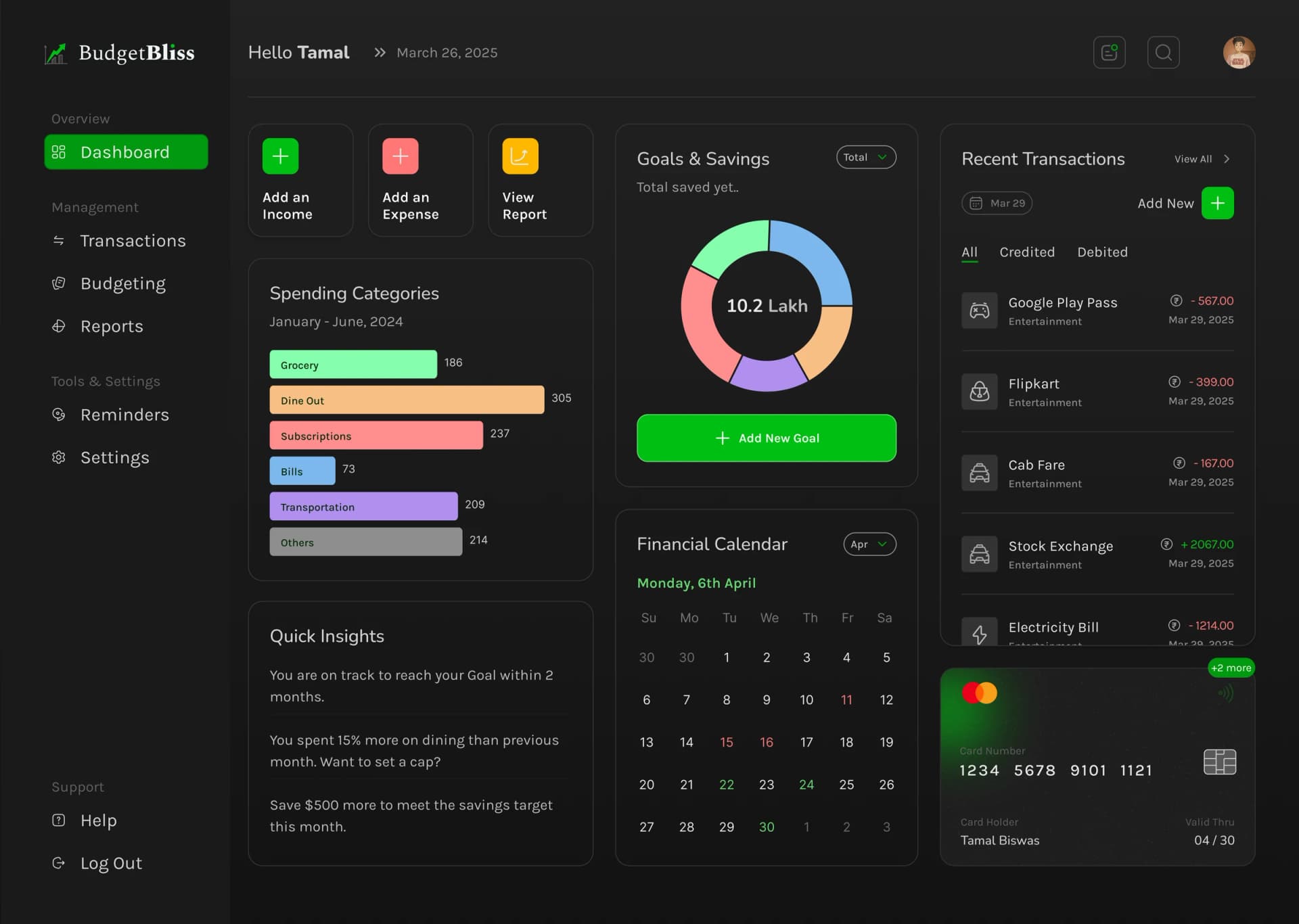
    Budget Bliss: Zero to Launch on a Fintech UI

    Budget Bliss: Zero to Launch on a Fintech UI

    FIG. — BUDGET BLISS

    An independent budgeting web app taken from Figma file to live deployment solo — a clean test of whether financial data can be presented without the usual wall of charts and colour-coded panic.

SECTION B · THE PLATESINTERFACE WORK · CONCEPTS & EXPLORATIONS

The Plates — interface design work

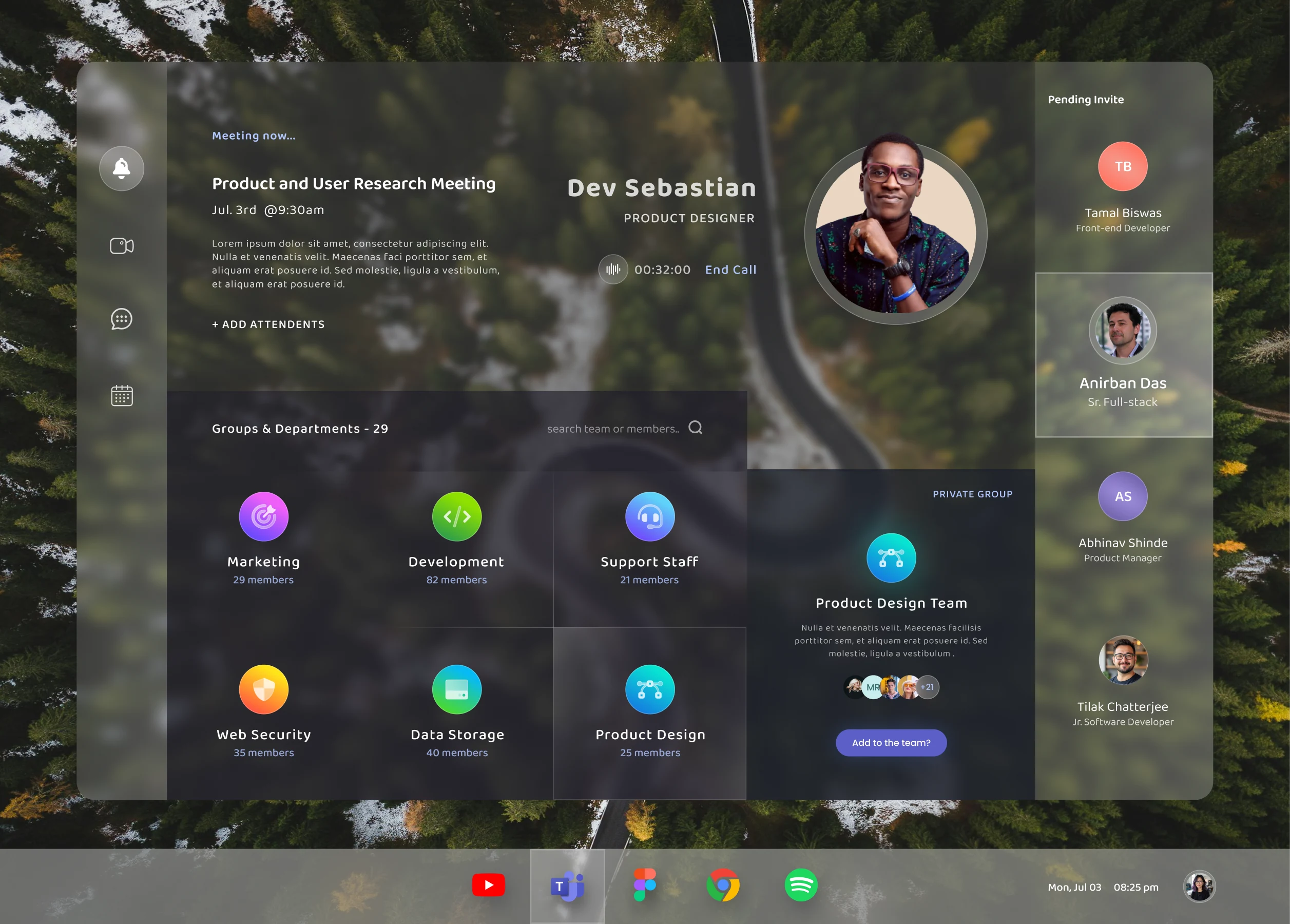
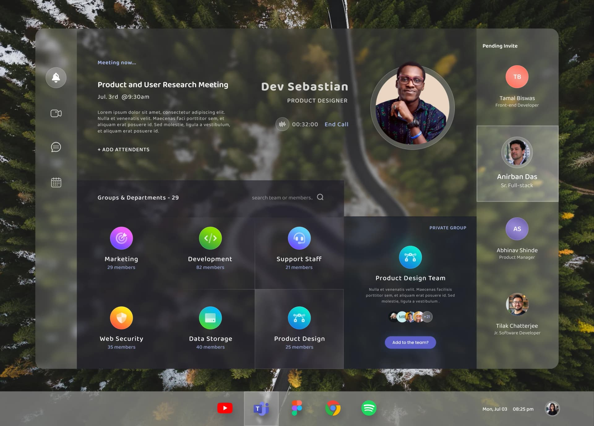
Concept redesign of the Microsoft Teams desktop app: a translucent panel over a forest wallpaper showing an active call, the meeting details, department groups with member counts, and a pending-invite list

PL. 01CONCEPT REDESIGN — ONE CALL, ONE DIRECTORY, NO PANELS

Microsoft Teams, without the chrome

Desktop · Figma · 2026

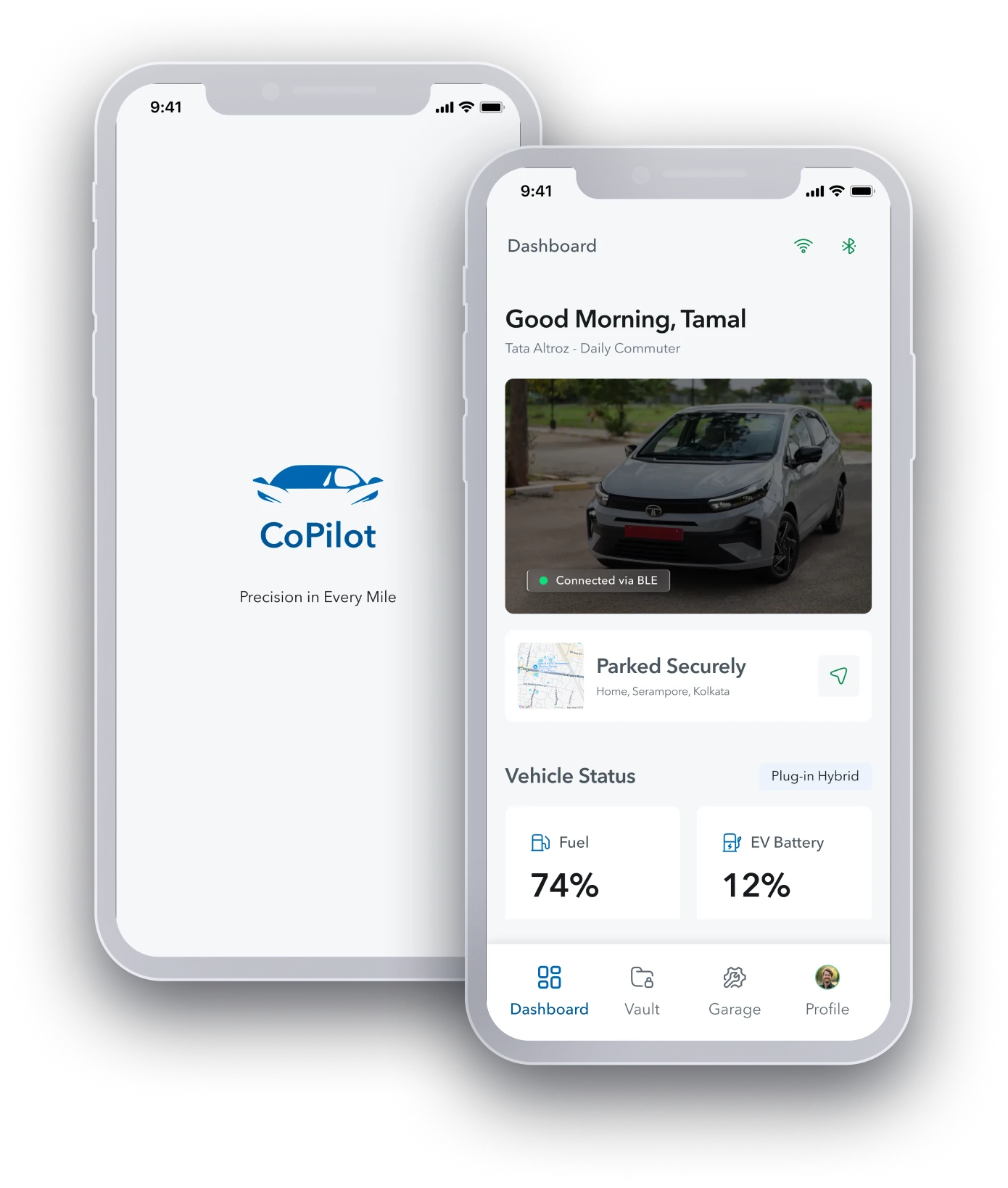
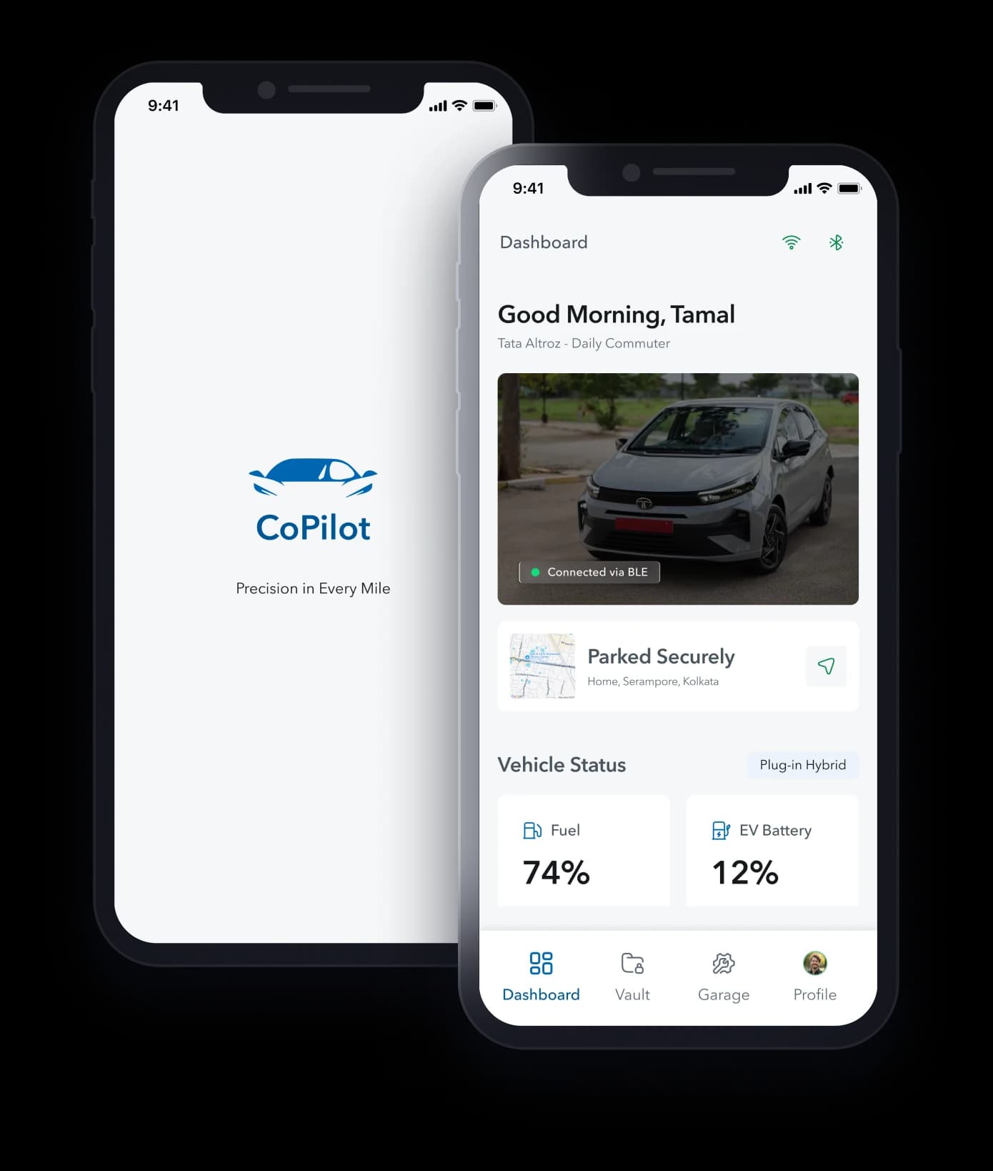
Two iPhone screens for CoPilot, a car companion app: the splash screen with its wordmark, and a dashboard showing the connected vehicle, where it is parked, and its fuel and battery levels

PL. 02A COMPANION APP FOR THE CAR: SPLASH AND DASHBOARD

CoPilot — precision in every mile

iOS · Figma · 2026

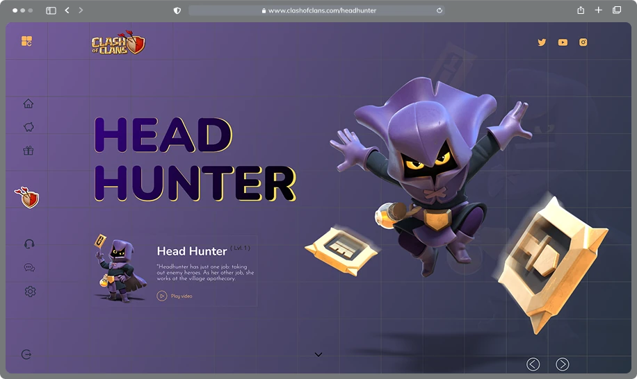
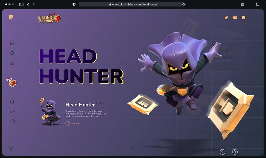
Concept landing page for the Clash of Clans character Head Hunter: oversized display type, the character rendered mid-leap, and a description card with a play-video link

PL. 03CONCEPT CHARACTER PAGE THAT PLAYS LIKE THE GAME

Clash of Clans — the Head Hunter page

Web · Figma · 2026


THE PRACTICEWHAT THE EDITOR ACTUALLY DOES BETWEEN ISSUES

The Practice — how I work

01

Design and build, same hands

The Figma file and the pull request come from one person, so there is no handoff to lose things in. I design in component states and Tailwind tokens because I am the one who has to implement them — which quietly kills the specs that were never buildable in the first place.

02

Systems before screens

One beautiful screen is a mood board. I build the spacing scale, the type ramp, and the colour roles first, then compose screens out of them. It is slower on day one and much faster by the fifteenth screen, which is where real products live.

03

Minimalism where it is hardest

Anyone can keep a marketing page clean. Clinical dashboards and financial UIs are where clutter actually costs something — a doctor scanning for one number, a person checking whether they can afford this month. Removing things there takes more nerve than adding them.


THE SPECIMEN SHEETHOUSE STYLE · TYPE · COLOUR · MEASURE

The specimen sheet — house design system

Every value on this sheet is in use on this page — inspect it and check. The system this documents is the site's own house style. The one I build at work belongs to the company that owns it, so none of its values appear anywhere here; this is the same job, done where you can audit it.

I. THE TYPE SCALE

MASTHEAD

Playfair Display · 900 · clamp(2.5rem, 7.5vw, 6rem)

line-height 0.9 · tracking −0.02em

The paper's name. Used exactly once per page.

Above the Fold

LEAD HEADLINE

Playfair Display · 900 · clamp(2rem, 4vw, 3rem)

line-height 0.98 · tracking −0.02em

The front-page lead and page H1s.

Three Platforms, One Designer

SECTION HEADLINE

Playfair Display · 900 · clamp(1.75rem, 3.2vw, 2.5rem)

line-height 1.03 · tracking −0.02em

Numbered sections inside a report.

Then I built it

CARD HEADLINE

Playfair Display · 700 · 1.6rem / 25.6px

line-height 1.06 · tracking −0.02em

Report cards and list rows. Bold, not black — cards sit below headlines.

Zero to Launch on a Fintech UI

BODY

DM Sans · 400 · 1.125rem / 18px

line-height 1.625

Every running paragraph. 18px because a broadsheet is for reading, not skimming.

One beautiful screen is a mood board. I build the spacing scale, the type ramp, and the colour roles first, then compose screens out of them.

SECONDARY

DM Sans · 400 · 0.95rem / 15.2px

line-height 1.375

Sidebar values, captions with substance, boxed copy.

Kolkata, West Bengal · remote, overlapping US, UK and EU hours.

LABEL

DM Sans · 500 · 0.5625rem / 9px · uppercase

line-height 1.45 · tracking 0.18em

The signature device. Kickers, flags, captions, nav, buttons. The 0.18em tracking is what makes 9px legible.

SECTION A · THE REPORTS · FILED 2025

II. COLOUR ROLES · CONTRAST MEASURED AGAINST PAPER

Paper

#f5f2ea

--color-cream

Page background. The one colour that is never text.

FILL ONLY

Ink

#1a1a1a

--color-ink

Headlines and primary text.

15.6 : 1 · AAA

Body ink

#302f2f

--color-ink / 90%

Running paragraphs. Softened so long-form reading is less harsh than pure ink.

11.8 : 1 · AAA

Newsprint

#57564f

--color-newsprint

Captions, labels, metadata. Warm grey, never a cool one — cool grey fights the paper.

6.6 : 1 · AA

Editorial red

#8f1d14

--color-accent

Links, kickers, calls to action. The only chromatic colour on the page.

8.0 : 1 · AAA

Accent wash

#f7e7e3

--color-accent-pale

Fill behind boxed calls to action. Fill only, never text.

FILL ONLY

Deep paper

#ede8da

--color-cream-deep

Band fills and the halftone placeholder ground. Fill only.

FILL ONLY

Rule

rgba(26,26,26,.16)

--color-rule

Every hairline on the page. Columns are separated by rules, never by shadow.

FILL ONLY

III. THE SPACING RAMP · 4PX BASE

1
4px
Icon-to-label gap
2
8px
Inside a label chip
3
12px
Kicker to headline
4
16px
Paragraph rhythm
5
20px
Boxed CTA padding
6
24px
List-row vertical
8
32px
Column gutter
10
40px
Section internal
16
64px
Between major sections

IV. DEVICES

RULES

1PX · RULE · COLUMN + ROW DIVIDERS

1PX · INK · BAND EDGES + NAV

2PX · INK · UNDER A SECTION LABEL

DROP CAP

Playfair Display at 800 weight, 3.4rem, floated left with a 0.82 line-height so it optically aligns to the first three lines of the paragraph rather than sitting on top of them.

CALL TO ACTION

PRIMARY · RESTING

ACCENT FILL · CREAM TEXT · 8.0 : 1

PRIMARY · HOVER

INK FILL — COLOUR GIVES WAY, IT DOES NOT BRIGHTEN

SECONDARY

2PX INK BORDER · NO FILL


SECTION D · THE COLUMNWRITING ON DESIGN SYSTEMS & INTERFACE CRAFT

The Column — writing


CLASSIFIEDSLETTERS, TELEGRAMS, SMOKE SIGNALS — ALL RECEIVED

Classifieds

WANTED

One (1) product team where design decisions are not relitigated in three separate meetings. Must have real users. Fast review cycle valued over free snacks.

FOR HIRE

Designer who ships the frontend, 2+ yrs. Fluent in Figma and TypeScript. Brings own opinions on spacing scales. Available immediately, full-time or freelance. Overlaps your timezone.

PERSONAL

To whoever left a 4px inconsistency in the tab bar of a shipped app: I found it. It has been fixed. We need not speak of this again.

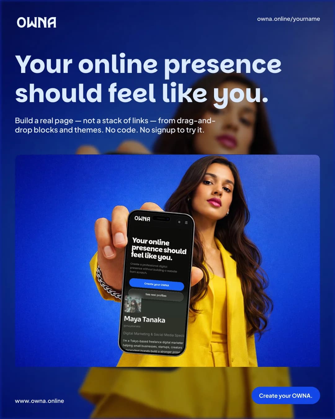
OWNA: The Link-in-Bio Alternative That Outgrew the List
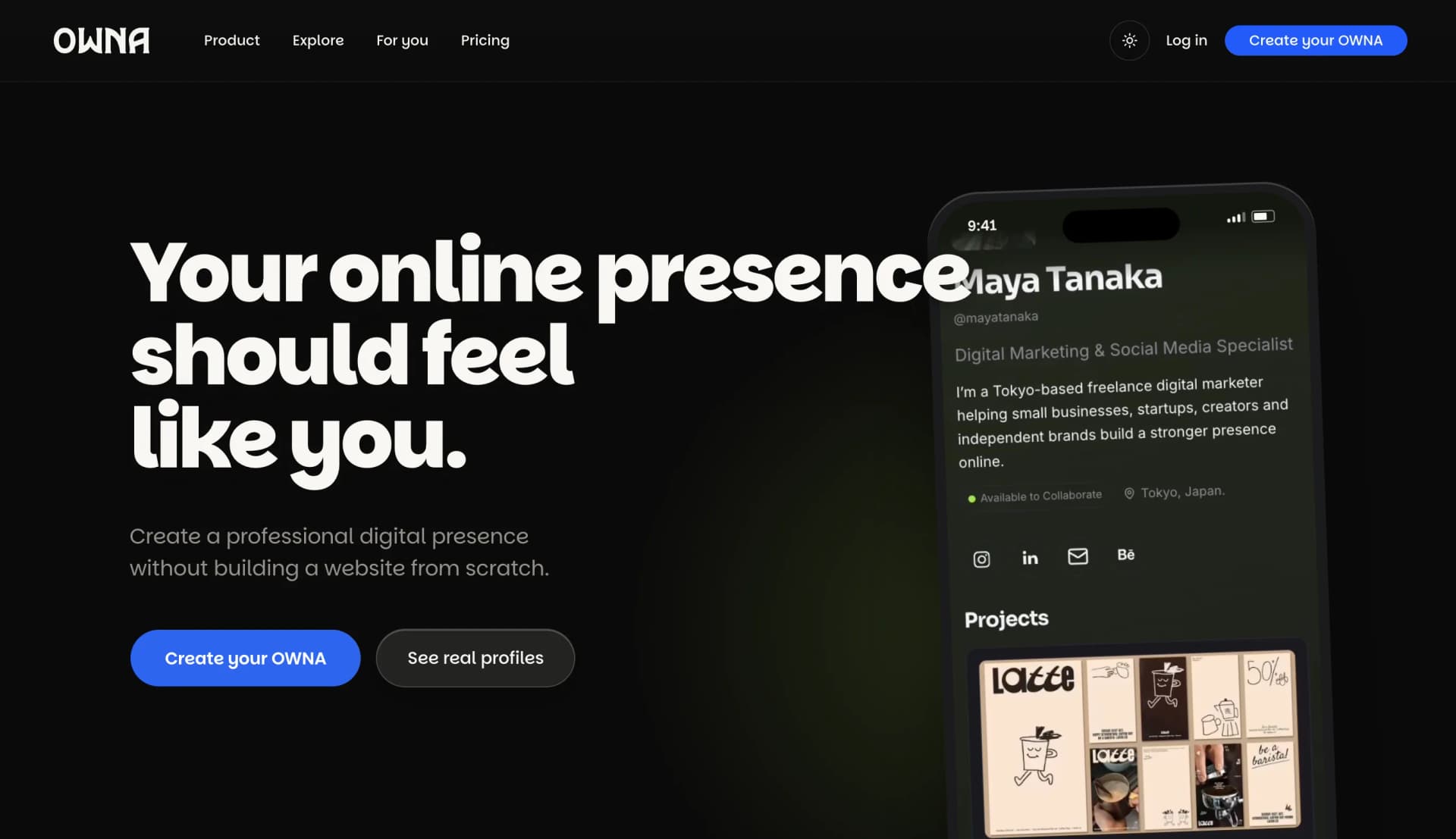
No. 01SAAS
Budget Bliss: Zero to Launch on a Fintech UI
No. 02FINTECH
OWNA launch post
No. 03LAUNCH
Microsoft Teams, without the chrome
No. 04Desktop
CoPilot — precision in every mile
No. 05iOS
Clash of Clans — the Head Hunter page
No. 06Web
OWNA: The Link-in-Bio Alternative That Outgrew the List
No. 01SAAS
Budget Bliss: Zero to Launch on a Fintech UI
No. 02FINTECH
OWNA launch post
No. 03LAUNCH
Microsoft Teams, without the chrome
No. 04Desktop
CoPilot — precision in every mile
No. 05iOS
Clash of Clans — the Head Hunter page
No. 06Web