OVERVIEW
Summary
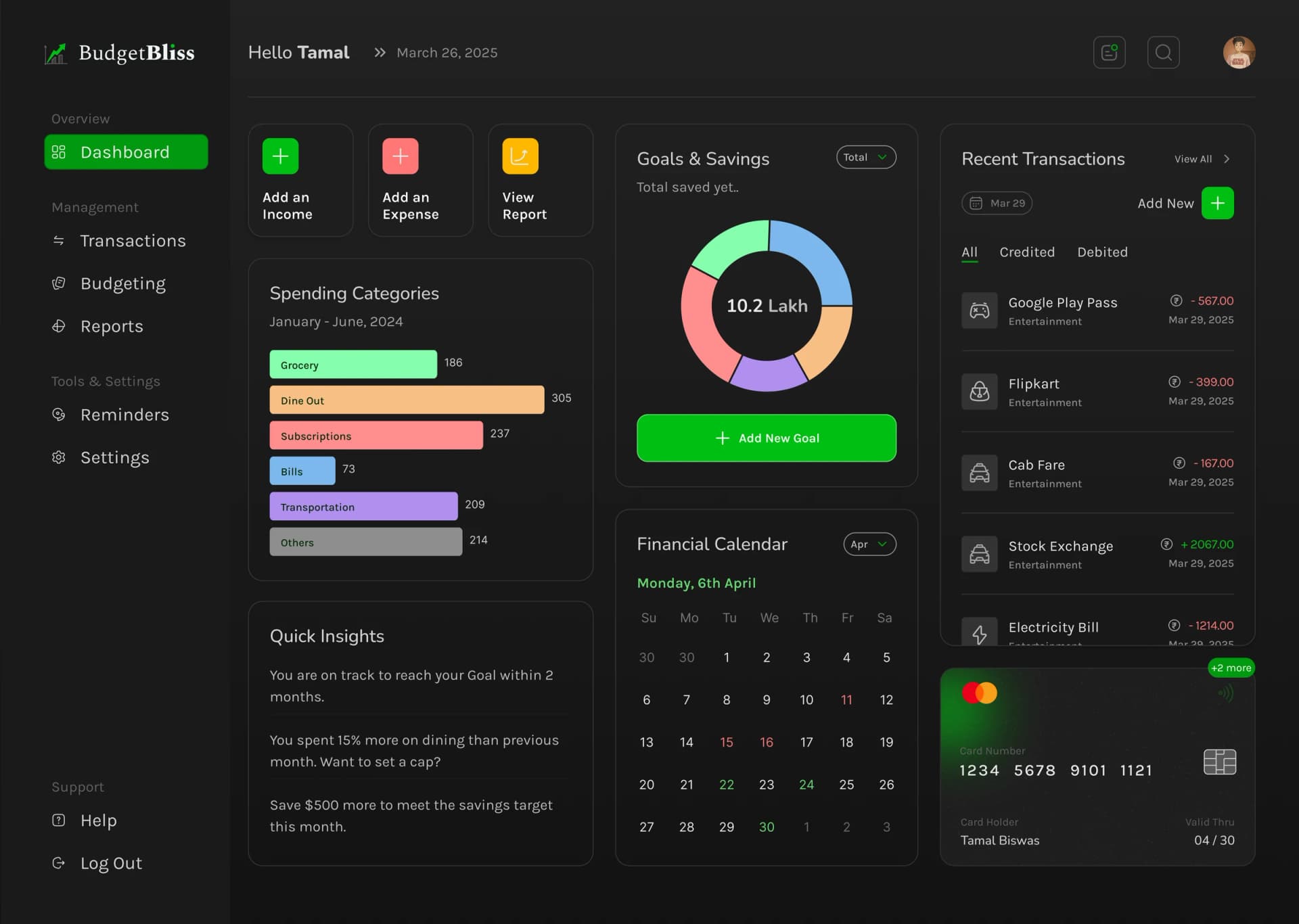
An independent budgeting web application, designed and built solo from a blank Figma canvas to a live deployment.
Nobody commissioned it, which is most of what it demonstrates.
01
Why I built it
Financial interfaces have the same disease as clinical ones and less excuse for it. Most budgeting apps answer a question nobody asked — a wall of charts, six colour-coded categories, three competing totals — when the actual question is almost always singular: can I afford this, or not.
I also wanted a product that was entirely mine, where no constraint was organisational and every decision on screen was a decision I had made and could defend.
02
What it does
Budget tracking with the numbers that matter given priority in the layout rather than equal billing with everything else. Clean data presentation, deliberately little chrome, and a visual hierarchy that puts the single most useful figure first.
Live at budget-bliss-nine.vercel.app, with the Figma file public too — so the design intent and the shipped result can be compared directly, which is a comparison portfolios usually avoid inviting.
03
Design decisions worth defending
Restraint with colour. Financial UIs reach for red and green almost reflexively, which turns routine information into a verdict on your month and fails anyone with a colour vision deficiency at the same time. Position and typographic weight carry the hierarchy instead.
Fewer views, each doing more. A side project has no roadmap pressure, so there was no reason to add a screen that existed only to justify a nav item.
04
Shipping it alone
Next.js, React, TypeScript, and Tailwind, deployed on Vercel. No handoff, no ticket queue, no negotiation — design in the morning, implemented and deployed the same day.
Working solo end-to-end is the clearest illustration of the case this whole portfolio makes: with one person holding both halves, the loop between intent and running software is measured in hours rather than sprints.
05
The outcome
A live fintech product built and shipped without being asked, and a clean demonstration that the same instinct applies whether the domain is medicine or money: find the number the person came for, and get everything else out of its way.